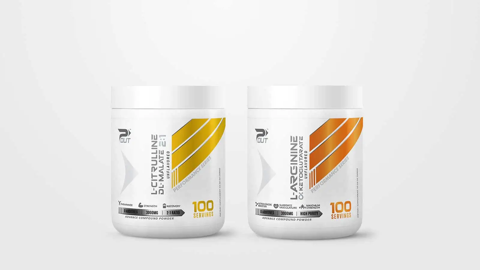
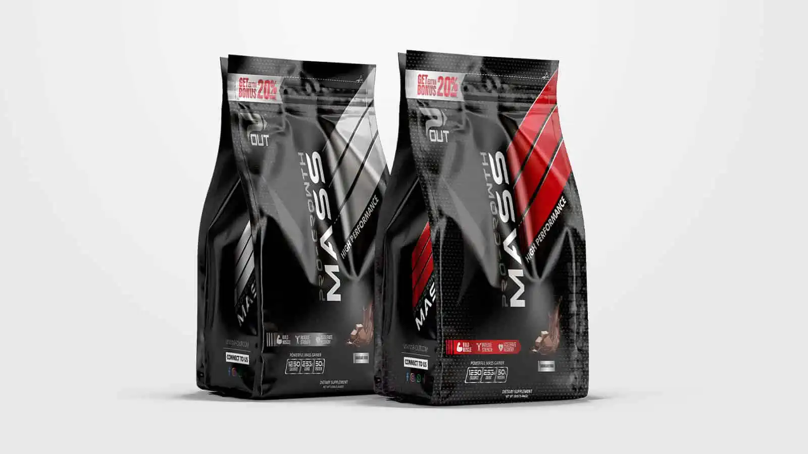
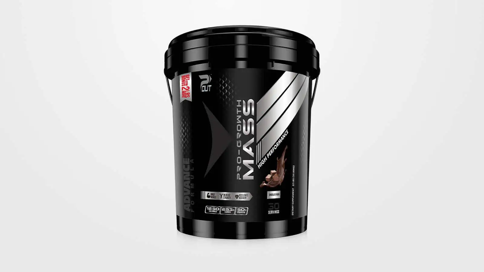
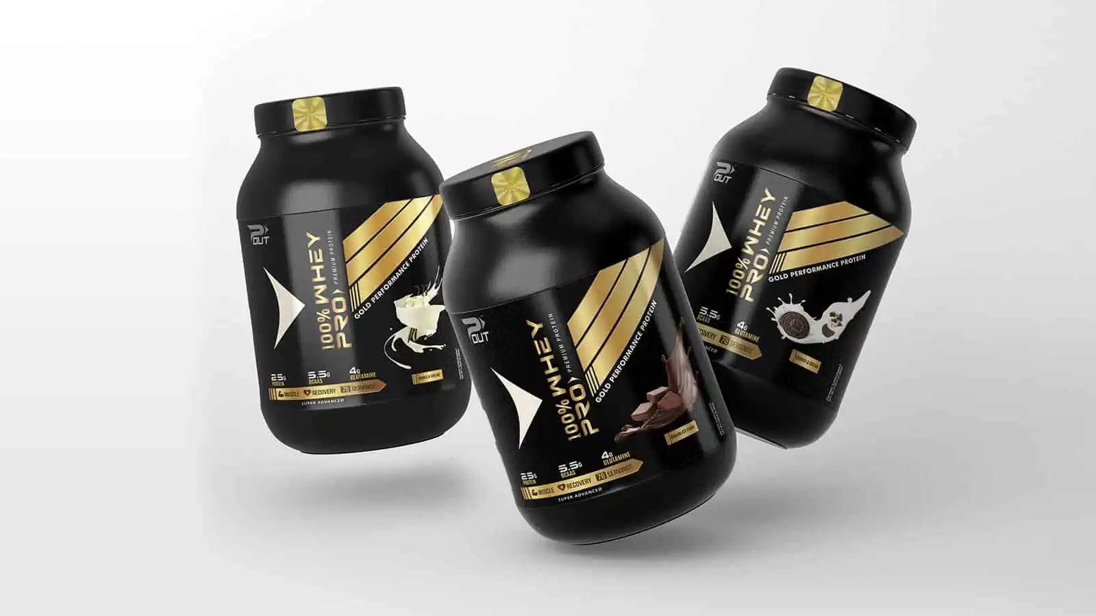
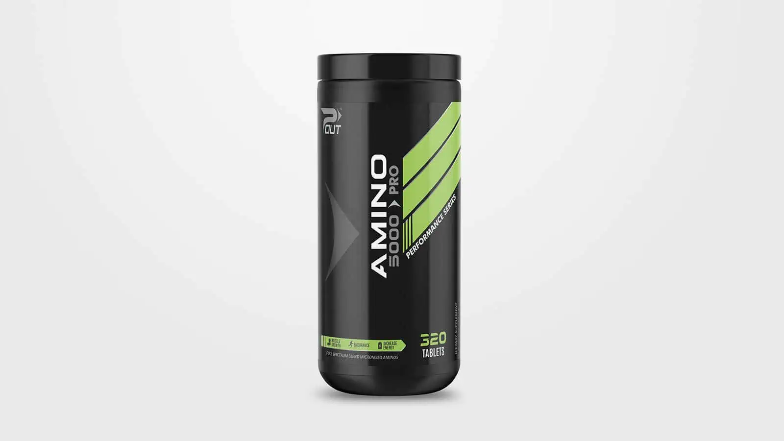
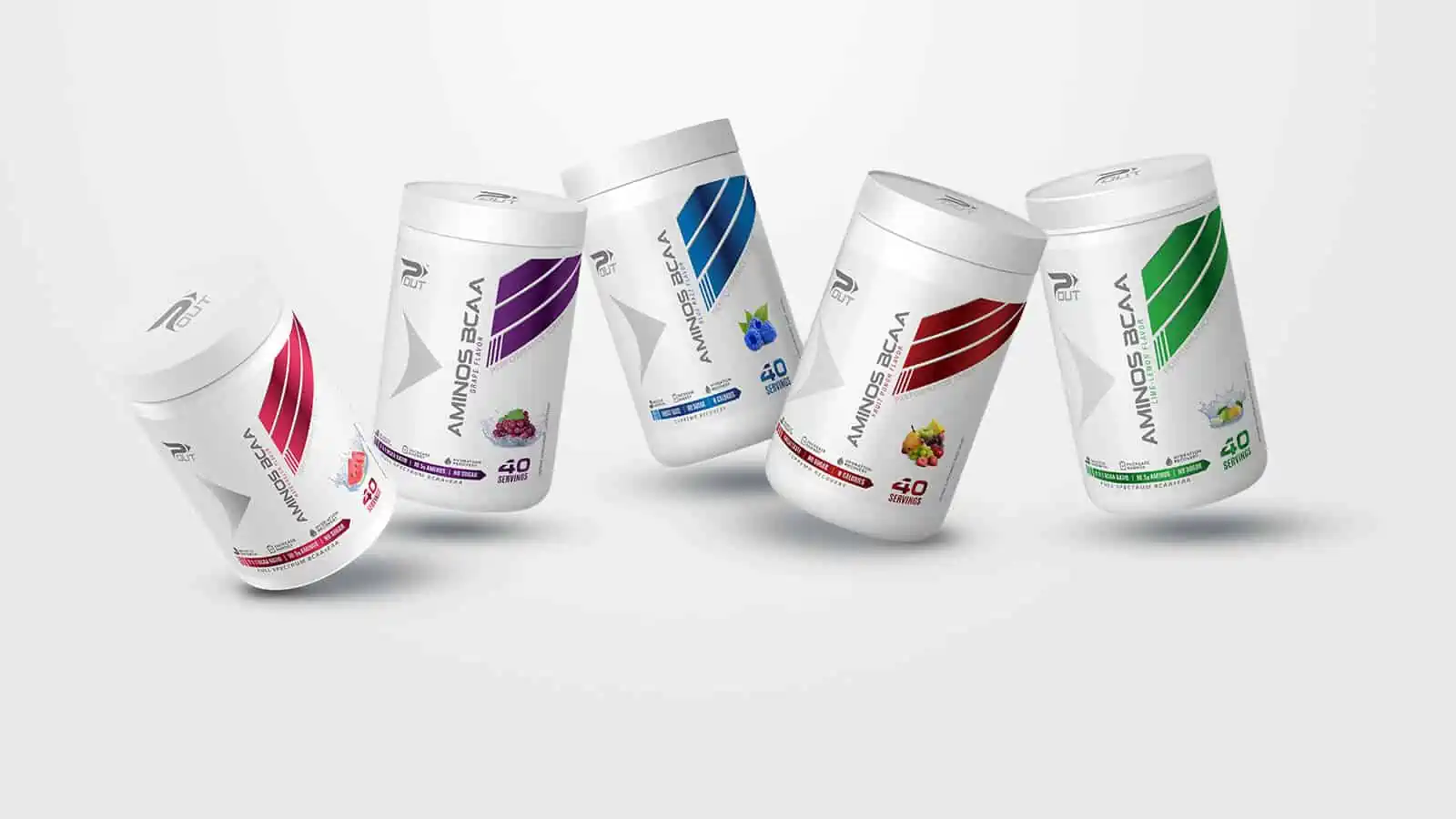
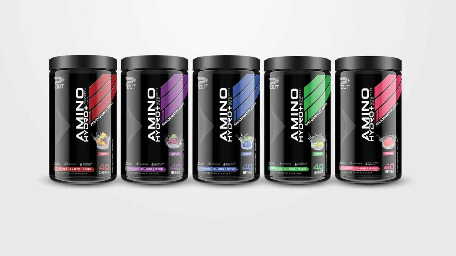
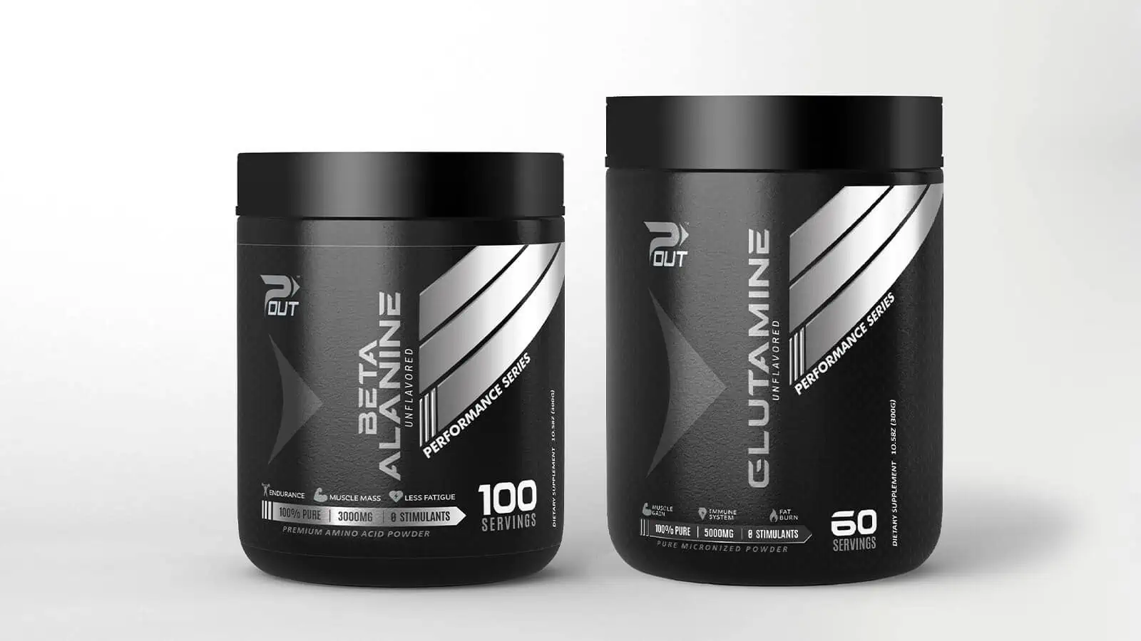
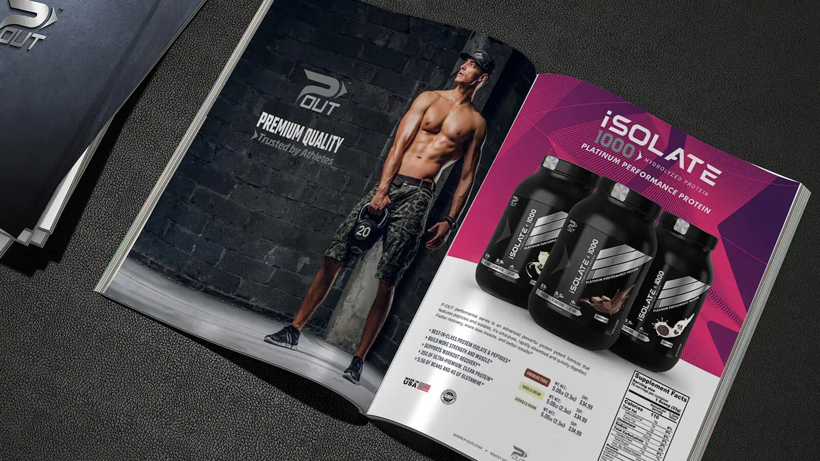
After several attempts to design the identity for P-Out products with “professional” companies, we received the opportunity to create something unique, strong, and at the same time simple with the letter P that represents the word Pumping and an arrow that means to take out over the word “OUT”
TRUSTED BY ATHLETES
Pumping Out is the original name of the company that had attempted a renovation of the design of its labels with a renewed logo that would represent its name as the insignia of its food supplements without success. Until we designed the entire P-OUT line.SERVICES PROVIDED
- Logo Brand
- Product Labels
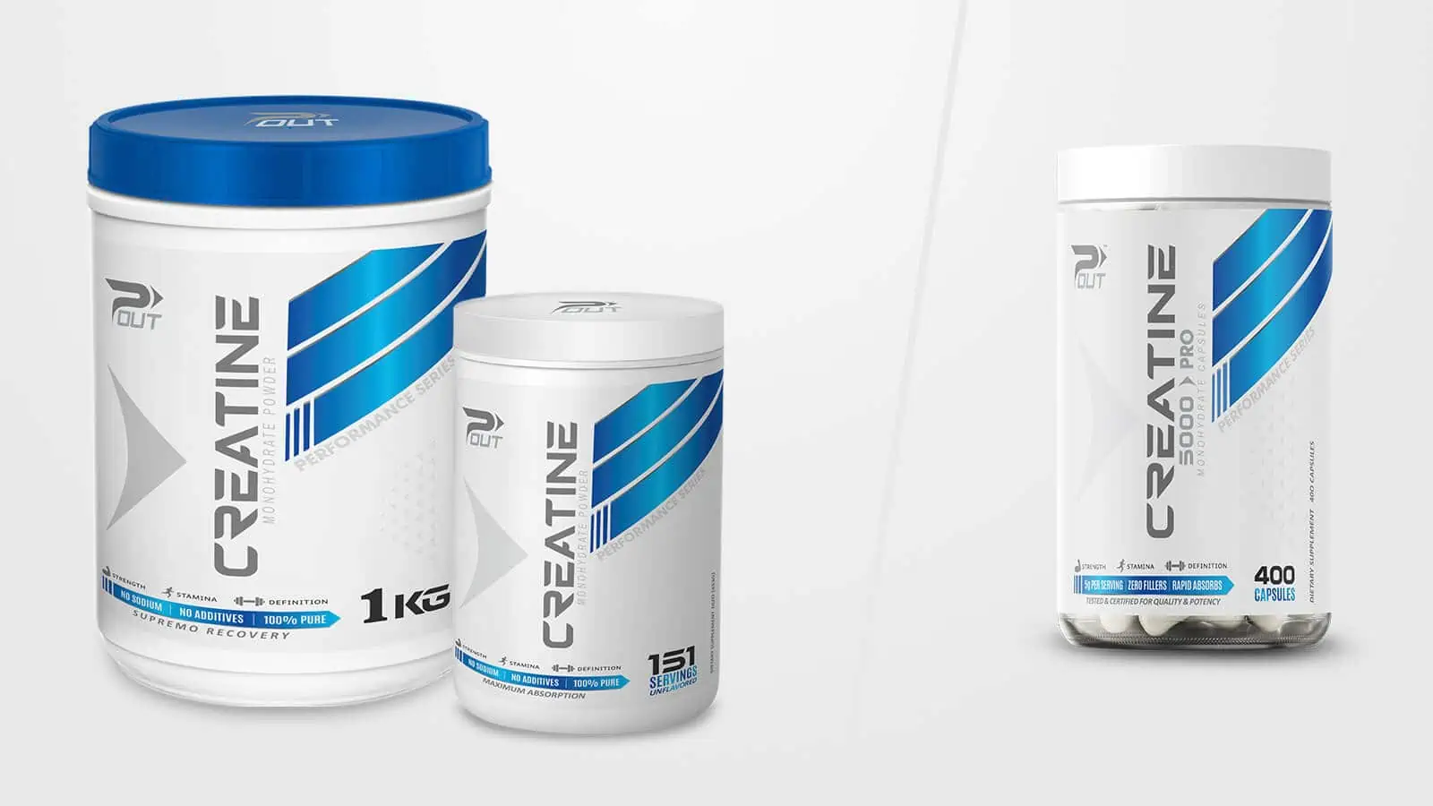
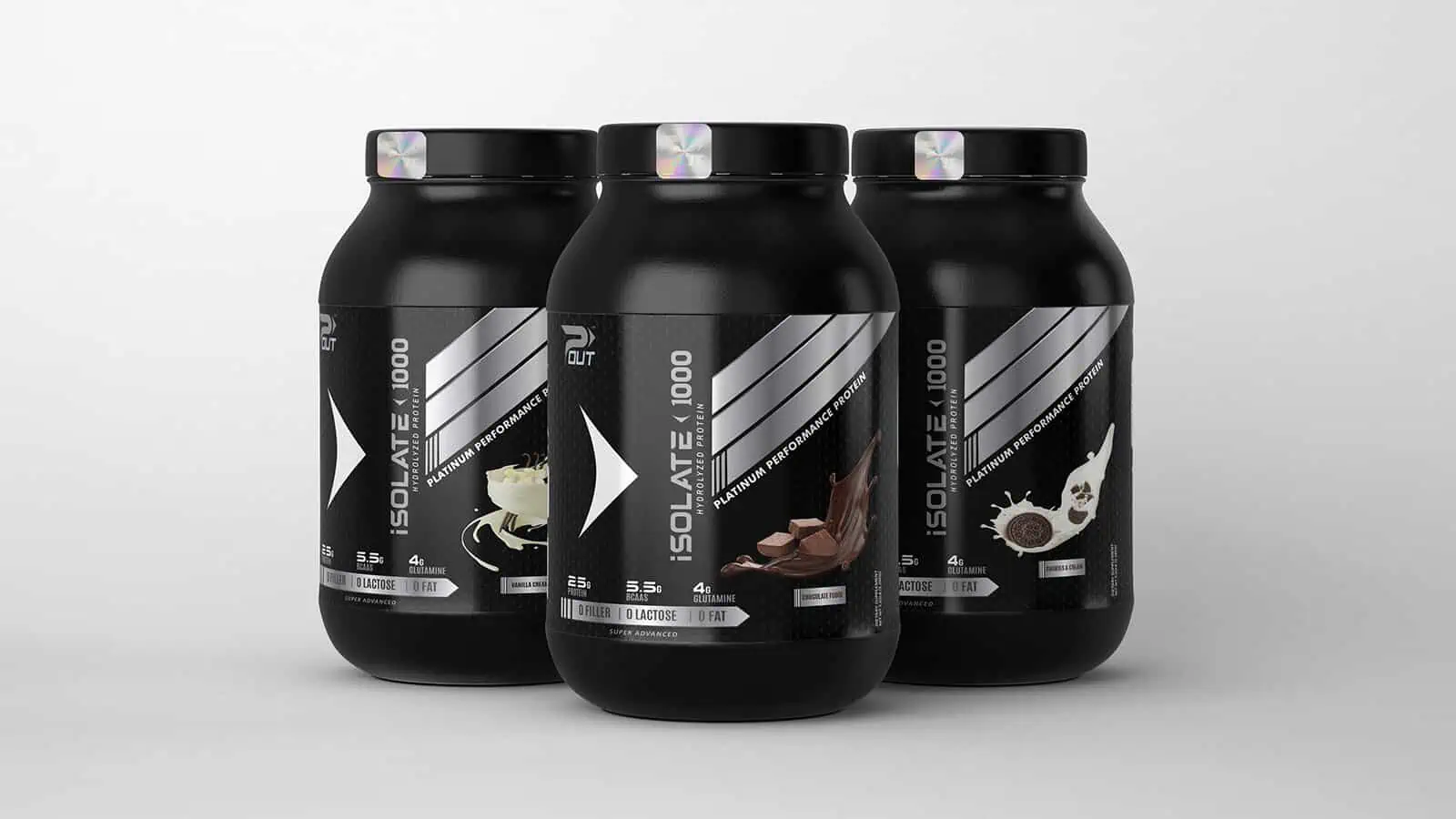
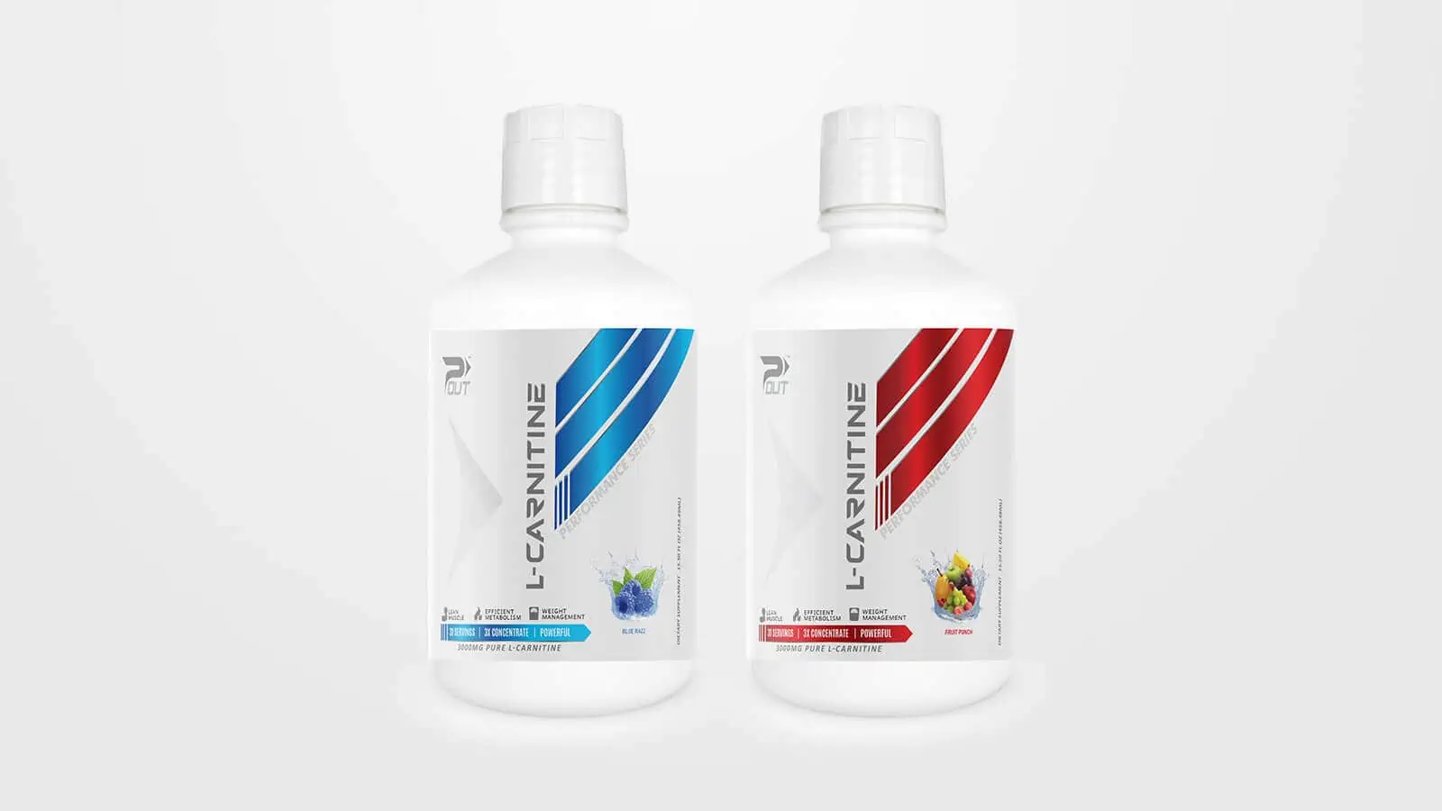
- Products Mockups
- Catalog Desing
| Play | Cover | Release Label |
Track Title Track Authors |
Page | Buy | Delete |
|---|